Friday, 30 March 2012

{ let’s design } my new bathroom

Post by: Victoria, ÉdinHome&Co

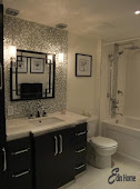
Isn’t this bathroom – from the 2010 Princess Margaret Showhome – gorgeous?!

307-00405_SUP_HH_DE10Source: House and Home       Photographer: Michael Graydon

For years I’ve been dreaming about having a beautiful bathroom like this one with its white marble (carrera or bianco) and simple, classic feel.

DSCF1910But… for years I’ve lived with this! ---- >

Pretty, ain’t it?! ;-)

I suppose I should explain the off-kilter clawfoot tub. This photo was taken as we were removing the tub in preparation for…. wait for it… renovation!

FINALLY!!

A sad confession… unfortunately the tub isn’t returning to the finished bathroom :-(   Instead, we’re building a walk-in tiled shower complete with a rainhead shower fixture!!

Let me show you what IS going into the bathroom… starting with the flooring…

Carrara Basketweave Floor


Doesn’t basketweave marble floor tile fill you with pleasure?!

My plan is to lay the tile in a similar format because it’s so darned lovely! We’ll also use the basketweave tile on the shower floor.

Picture17For the walls I’m planning on using marble subway tiles in an off-set pattern… just like the Princess Margaret home (above) :-)   And I’m seriously thinking about adding a black border detail similar to this one. What do you think?

One element of the new bathroom I’m excited about is using a vintage dresser for the vanity!

Here’s the one I found… complete with a coordinating mirror! (note: I won’t be using the mirror mount – just the cabinet and the mirror)

2012-03-09 18.53.122012-03-09 18.55.28

I’m really happy with this purchase!

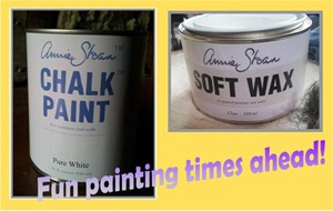
In the next week or so I’ll be taking paint & brush to these pieces… but not just any paint: Annie Sloan Chalk Paint. Soon my vanity and mirror will be white, slightly distressed and perfect for my vintage cottage bathroom!!Picture18


This is what the bathroom looked like the other day!

2012-03-22 18.20.43


At this point I’m planning on a marble or white quartz counter for the dresser… but it’s all about budget!!

Cross your fingers for me please!

And here are the pulls I’ve picked up for the dresser :-) 2012-03-22 18.21.47

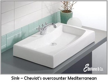
Lastly… the overcounter basin and faucet (in chrome)!

pic_MediterraneanOvercounterLavatoryKohler Archer

One more lovely carrera marble bathroom to give me inspiration!!

a937aa9375c5

I hope you’ll drop by to see how the bathroom looks once it’s complete!

Signature 2[3]

Tuesday, 27 March 2012

it’s a cinch: { let’s create } maritime map letters

BThe ladies at Thistlewood Farm, It All Started With Paint, Eclectically Vintage, The Cottage Market, and The Space Between are having another great blog party today called It’s a Cinch. The premise – do an easy-peasy project that you can finish quickly and with minimal effort.

I’m sure this project took way longer than it should have. But thanks to my {1} inability to focus on one thing for more than five minutes, {2} habit of making things 20 times more complicated than they need to be, and {3} an ingrained need for perfection, everything I do takes longer than it should. {Have I mentioned that I’m a little on the OCD side? Picture Sheldon on The Big Bang Theory with boobs. Yep, that’s me.} So overall, I probably spent a few hours creating creating my map letters {not including waiting time between a couple of steps}. But it was super-easy to do.

This is my It’s a Cinch project inspiration:

From Stylish Living Catalogue 2010

I had already bought white wood letters at Michaels for 50% off {I think they were around $3.50 each} I totally forgot to take a “before” picture of them – DOH! I bought the letters B E A C H. These are somebody else’s letters that look just like mine…

wood lettersvia lazy mondays

When I saw the PARIS map letters on Pinterest, I was like, YEAH, now I know what to do with the letters! So I searched the Net for some maps of beaches that I’ve been to. Originally I was going to do use a separate map for each letter, but then I came across this whopper map of the Maritimes:

Maritimes-Map

I like the soft colours and old look to the map. And after I printed it out on 16 sheets of 8-1/2” x 11” paper, I realized I could fit each letter onto an area of the map that I’ve been to – PEI, Cape Breton, and three other areas in Nova Scotia {including my beloved Lunenburg region}.

map with letters

Once I figured out where I wanted each letter to go, I cut each section from the original map image on my computer and printed each one out on its own sheet of paper. That way, I wouldn’t have to cut off the white borders and try to match up seams between sheets of paper.

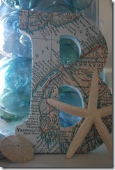
B mapMap section for the letter B

Next, I traced around the letters and cut them out.

letters cut out

B map 2

I painted the sides of all the letters a light bluey-green. I realize now that I didn’t get any good pictures of the painted letters. DOH again! Anyway, after the paint dried, I used Mod Podge to attach each map letter  onto each wood letter. And voila, Maritime map letters!

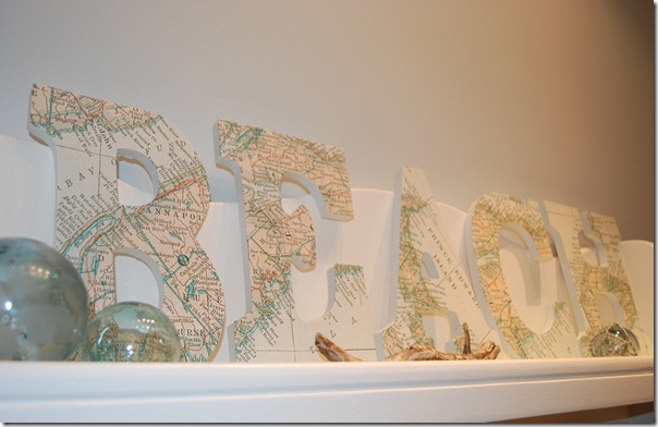
BEACH

I used a little creative license with the A – I turned PEI about 70 degrees so I could fit more of of the island onto the letter.

A

And I made sure to fit my very favourite part of the Maritimes onto one of the letters – this is the Lunenburg region in Nova Scotia on the letter E:

E close

I still haven’t completely finished the letters – I don’t know if I want to seal them with Mod Podge or the spray sealer that I use on my paintings. And I have to decide where to hang them too.

And there you go, an easy-peasy It’s a Cinch project! If you want to create your own map art, there are some great ideas at Your Decorating Hotline. And check out Jason LaFerrera for a completely different & amazing take on map art.

Don’t forget to do the rounds at Thistlewood Farm, It All Started With Paint, Eclectically Vintage, The Cottage Market, and The Space Between to see more It’s a Cinch projects :-)

Also linking up to Nifty Thrifty Tuesday at Coastal Charm ‘cause these babies are definitely coastal! And pretty nifty too, if I do say so myself :-)

kelly sig

Sunday, 25 March 2012

{ let’s design } AyA “blogpodium bound” contest

AyA kitchens and Bathsblogpodium logo

When I attended the inaugural BlogPodium event during IDS12 in Toronto this past January, I learned so much about how to improve my blog and blogging skills. {Click here to read all about it}. So I’m really excited about the next BlogPodium event that’s happening on Saturday, May 26th. And just as excited about the opportunity to have my airfare and hotel covered by AyA Kitchens and Baths! AyA has teamed up with BlogPodium to sponsor the AyA “BlogPodium Bound” Contest – the winner gets a flight to Toronto, two nights accommodations, and a ticket to BlogPodium. Pick me, pick me, pick me! Please :-)

Here’s my dream kitchen entry…

moodboard with numbers 3

  1. Allegra diamond glass-front upper cabinet doors in Latte, AyA Kitchens and Baths
  2. Bedford cabinetry for some upper doors and all lower doors & drawers in Latte, AyA Kitchens and Baths
  3. Bedford island in Anthracite, AyA Kitchens and Baths
  4. Backsplash: Mosaic glass tiles, Opulence OP-07, Glazzio Tiles
  5. Island countertop: Bianca Carrara honed marble, Uniform Custom Countertops
  6. Countertops (except island): Hanstone in Sterling Grey, Uniform Custom Countertops
  7. Three pendant lights above island: Polished Nickel Large Square Lantern, Union Lighting
  8. Paisley fabric for window treatments: 9016A-S2550, C&M Textiles
  9. Flooring: Birch 3/4” x 5” hand scraped - Walnut Colour, Home Depot
  10. Glass knobs: Hexagonal glass knobs for all doors, Lee Valley
  11. Nickel bin pulls: Amerock Sterling Nickel Finish Cup Pull for all drawers, Home Depot
  12. Barstools: Three Vega barstools for island, www.allbarstools.com
  13. Faucet: Belo pull-down faucet & soap dispenser in chrome finish, Brizo
  14. Wall colour: Aura AF-670 Nightingale, Benjamin Moore
  15. Backs of upper glass cabinets: Aura AF-570 Coastline, Benjamin Moore
  16. All upper and lower cabinets painted Latte, AyA Kitchens and Baths
  17. Island painted Anthracite, AyA Kitchens and Baths

description 3Whew, squeezed it all into the 100-words-or-less limit!

Thanks to AyA Kitchens and Baths for sponsoring the AyA “BlogPodium Bound” Contest. Whether I win or not, I’m really looking forward to seeing everyone at BlogPodium and hearing what the guest speakers and expert panellists have to say. I’m sure I’ll come away from the event with a brain packed full of all sorts of great information!

kelly sig

Saturday, 24 March 2012

they don’t build them like they used to

I recently came across this painting project by Charlotte over at The Modern Midwestern Home:

charlotte 1

Charloltte did a great job creating the herringbone pattern on a wall in her kitchen. Pretty fantastic, don’t you think? And also pretty fantastic is that grid detail on the door. I assumed that it was a DIY project, but Charlotte said that the doors are original to her 1941 house.

charlotte 2

charlotte 3

Soooooooo much better than the typical raised panel doors that are the go-to doors for builders today. They definitely knew how to add character to homes 60 years ago! Another case in point – this abandoned old house near the village of Benburb, Co. Tyrone in Northern Ireland. Just look at that great door and all the amazing window details…

door flickrPhoto by ©NIreland eye, via Flickr

Here are some more amazing abandoned houses & buildings from Design Your Way:

Abandoned Dilapidated House Photography

Abandoned Bennett College Photography

abandoned hotel, Abkhazia Photography

West park abandoned hospital Photography

abandoned institute Photography

Abandoned House HDR Photography

Filthy, money, and amount of elbow grease required aside, I would LOVE to get my hands on an old house and restore it to its former glory.

Do you live in an old house with the original details?

kelly sig

Thursday, 22 March 2012

{ let’s imagine } pretty pillows

Victoria ~ EdinHome Co.

A few weeks back I purchased this fabric to make pillows for my new product line, The Edin Collection (launching in mid-May)…

Pillow Fabric

I really enjoy the design process involved in creating lovely and unique soft furnishings, especially with fun fabrics like these! Before I started cutting I played with the fabric to determine which coordinating fabrics and patterns worked best together, I sketched a few pillow-front ideas like using buttons, incorporating fabric/pattern blocking or taking advantage of directional prints and – based on my sketches – I created some patterns to get me started.

Before I can get down to the business of creating though, I seek out inspiration! Interiors shared on all my favourite blogs are extremely inspirational, and of course I devour the beautiful pages of my Canadian House & Home and Style at Home magazines!!

Real-life inspiration is the best though!!

Like this sweet pillow from Anthopologie

Anthropologie Pillow

I explored this wonderful new-to-Vancouver store yesterday while on the hunt for drawer pulls for my “new” bathroom vanity (a soon-to-share story!!) and was immediately inspired by this flower appliqued pillow. I found myself thinking how not only could I make a pillow like this, my coordinated fabric would be perfect!

So don’t be surprised if you see a similar pillow as part of The Edin Collection :-)

Signature 2[3]

Tuesday, 20 March 2012

hello, spring & yay, i’ve been published!

spring5 YAY! It’s officially the first day of spring! Although it’s feeling a lot more like summer – it’s been in the mid-20s here the last few days, and it’ll be hot till Friday. How crazy is it to be wearing a T-shirt and shorts outside when it’s still technically winter!? Well, OK, I guess it’s normal if you’re lucky enough to live somewhere that’s always warm and sunny ;-) But here in Ottawa, wearing summer clothes outside when there’s still snow on the ground is just WAY too weird!

And equally exciting as the warm & balmy weather is that I’ve been published in the Spring 2012 issue of Our Home Ottawa! YAY! It’s just a small half-page article about Extreme Makeover: Kindness Edition, but better small than not at all! Plus when you’ve been writing your whole life and have always dreamed of being published, it’s a pretty major thing :-) Click here to read the Spring 2012 issue online. My article is on page 67.

article our homes ottawa

Five easy ways to say hello, spring!

1. Fresh flowers

The tulips are just starting to poke through the soil, but it’ll still be a month or so before they’re in full bloom. Get a head start on spring flowers with fresh flowers in your home. You can pick up an inexpensive bouquet at your local grocery store and either display it as one big bouquet, or break it up in to smaller arrangements to scatter throughout your home. {I shared this flower decorating tip on the Style At Home blog here.}

blue vases white flowersImage via beahcomber simply living

2. Freshen up your front door

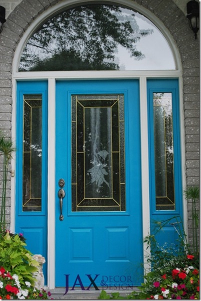
Have you been thinking about sprucing up the front of your house, but you’re not sure how? A couple of coats of paint on your front door will freshen things up. Just make sure the temps are 10C or above before you get going. If you’re feeling daring, why not go with a not-so-typical front door colour {just make sure it works with the style and colours of your house}. My front door is CIL Peacock’s Plume – it makes me happy every time I come home :-)

turquoisedoor logo

Although I camethisclose to painting my door bright green, just like this awesome door:

Bright_front_doorImage via Shelterness

Hmmmm, maybe a project for this spring…

3. Fresh air

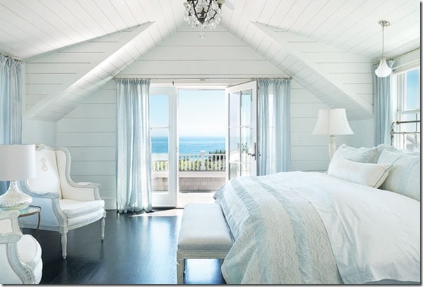
open up your doors & windows and enjoy the fresh spring air blowing through your house. Extra-sweet if it’s oceany spring air!

breezy bedroom 
Image via House of Turquoise, deign by Donna Elle Interior Design

4. Spring-cessorize

You don’t have to do a lot or spend a lot to spring-cessorize your home. Change up the cushions on your sofa, put away the cozy throws, rearrange your accessories. Cushions like these in a bold floral fabric will instantly bring spring into your home. {These babies aren’t cheap, but you could probably find similar cushions at HomeSense/HomeGoods, or even sew a few of your own.}

 bluebellgray1
Poppy from Bluebellgray

bluebellgray2 
Secret Garden from Bluebellgray

Sea_flower_cushion_-_Red
Sea floral cushion from Kristy Lee Interiors

5. Clean up the patio & deck

Hose down the deck boards, clean & set up the patio furniture, and get ready for lots of al fresco dining from spring till fall.

Voiles sur la terrasse - Un Cœur en Provence ©

How do you welcome spring into your home? Leave a comment and let us know :-)

kelly sig 

Photograph of pink blossoms via GPS.